Instructions
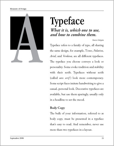
Below is all the text for one page in a magazine article. It's in the order it will appear on the page, but without conventions of placement and size, it's a bit confusing to know what's what. See if you can identify the following items in the list.
- author
- title of the article
- page number the article appears on
- magazine title
- subhead in the body copy
Elements of Design Typeface What it is, which one to use, and how to combine them. Aaron Inkpen Typeface refers to a family of type, all sharing the same design; for example, Times, Palatino, Arial, and Verdana, are all different typefaces. The typeface you choose conveys a look or personality. Some evoke tradition and stability with their serifs. Typefaces without serifs (called sans serif) look more contemporary. Some script faces imitate handwriting to give a casual, personal look. Decorative typefaces are available, but use them sparingly, usually only in a headline to set the mood. Body Copy The bulk of your information, referred to as body copy, must be presented in a typeface that's easy to read. And remember, never use more than two typefaces in a layout. September 2008 15 |
Now, view the following page layout and try to identify the items again for the same text that appears with the conventions of placement and size. Notice how much easier it is to locate information in text that is effectively laid out.

![]()