Lesson 1.3C: Interpreting Visuals
What's the more useful answer to the following question:
How do I get from the BC Royal Museum to the Belfry Theatre?
"Start by going south on Government Street towards Superior. Turn left onto Superior Street, which will turn into Southgate, and follow it to Cook Street. Turn left and go up Cook until you arrive at Fort Street where you will turn right. Go along Fort for a few blocks and then turn left at Fernwood. Go up Fernwood and shortly after you pass Grant Street you will see the Belfry Theatre on your left."
OR,
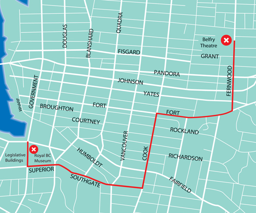
You probably picked the map. In this case the map was more efficient at presenting the information than the written instructions. Different visual elements can provide us with a lot of information. In this lesson we'll explore a few of them.
How to View Visual Texts
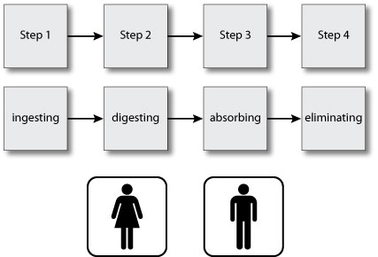
A visual text conveys information through an image. Some, like maps, are primarily image, supported by some words. Others, like flow charts, may hold blocks of written text, but the arrangement of these blocks conveys a sequence, and so adds meaning the sentences alone do not have. Some visual text conveys meaning using no words at all: for example, the male and female characters you find on washroom doors.
In looking at visual text there are some questions you can ask yourself to find meaning. Look at the visual texts below and apply these questions.
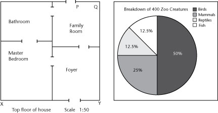
- What is the visual's purpose - to instruct, persuade, or create interest? (For example, the floor plan instructs people that the bathroom can be accessed from both the master bedroom and family room.)
- What type of information, numbers, shapes, concepts, or sequence does this visual depict? (For example, the pie chart shows half of the zoo population is made up of birds.)
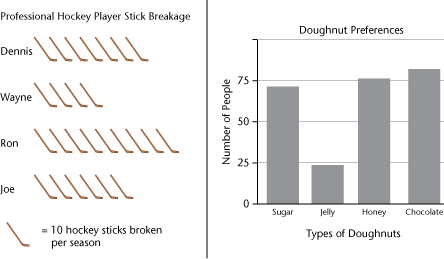
- What judgment, conclusion, or interpretation is being emphasized? (For example, the bar chart shows that jelly donuts are the least popular by quite a large margin.)
It is important to read the written information in visual text such as titles, labels, legends, and notes.
For example, in the hockey stick diagram there is a title that tells you what the diagram represents: "Professional Hockey Player Stick Breakage". The legend at the bottom gives more important information ("one hockey stick equals 10 sticks broken in a season") so we know Joe broke 60 sticks, not 6.
Here's another example:
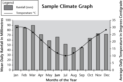
Let's look again at the set of questions we can use in looking at visual text so you can begin to sort, interpret, and draw conclusions about this graph.
What is the visual's purpose - to instruct, persuade, or create interest? I think it's to instruct.
What type of information, numbers, shapes, concepts, or sequence does this visual depict? Let's break this one down into several questions:
- Where's the graph title? Right, it's at the top, centred. This is a climograph, so it must have something to do with climate. Hmmm, what about climate?
- There are some labels along the side. They have to do with rainfall and temperature. Okay, so this graph is presenting information about these two things.
- How else is it organized? Ah, there's more information along the bottom … months of the year. This graph must look at rainfall and temperatures over the course of one year.
- So what is the relationship between these three things - rainfall, temperature, and months? The legend in the top left corner might help me to understand this. Okay, rainfall is the grey bars on the graph and temperature is the line going through the dots. And for each month of the year the rainfall and temperature is shown.
What judgment, conclusion, or interpretation is being emphasized?
- Putting this all together, this graph shows how rainfall and temperature are related over a twelve-month period. I can see that temperature and rainfall are kind of related - for most months, higher temperatures go with higher rainfall. Also, in the summer months the temperature and rainfall is lower than in the winter. That's partly opposite to where I live, where the temperature is higher in the summer. So this must be the climate graph for somewhere in the southern hemisphere.
Did you notice that you had to look carefully at all the pieces of information to fully understand what was being presented? Keep this in mind - now it's your turn to interpret a graph.
Summary
Completing this lesson has helped you to:
- explain how visual elements create meaning
- comprehend a variety of visual texts
|


 Complete


